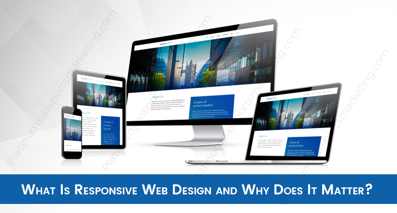
Responsive web design is a concept that includes numerous different design and development factors, and unless you’re an expert web designer, it’s unlikely you’ll ever be able to master all of the different design elements that go into building a responsive site. However, as a marketer, it is still important that you understand what responsive web design is, why it matters for your business’s website, and a few of the factors that go into building responsive web pages.
What Is Responsive Web Design?
The idea of building responsive web pages didn’t really come into play until the early 2000s, when smartphones and other mobile devices began to gain popularity as a way to access the internet. However, in those early days, marketers simply focused on building separate, mobile-friendly sites. These sites would detect that they were being accessed from a mobile device, and redirect the person to the mobile-friendly sites instead of the desktop version of the web page.
This worked well at first. But now, there are hundreds of different kinds of mobile devices, and hundreds of different screen sizes to consider. It’s difficult to get two versions of your website to display properly on hundreds of differently sized screens.
This is where responsive web design comes in, and enables a site to display properly regardless of the size of the device being used. The site can even adjust the way it displays when the viewer adjusts their scalable browser window, responding to the viewer’s preferences instantly. If they resize the browser window, the images, text size, toolbars, and other website elements will adjust to better suit the new viewing method.
One way to think of it is to imagine that your website’s content is like water. If you pour that water into a cup, it takes on the shape of the cup. If you pour it in a pitcher, it takes the shape of the pitcher. The content on your website should respond to screen size in much the same way that water responds to container size—it should adapt.
Why Does It Matter?
So why is it important that you have a responsive site design? The answer is simple: Because you want to keep traffic on your site, not drive it away. The majority of internet searches are now performed on mobile devices. If a potential customer finds your website via an online search, clicks on your site, and finds a design that is difficult to navigate on a mobile device, they’ll be quick to return to their search results and choose another site.
Non-responsive web pages essentially tell mobile users to go somewhere else, because you can’t be bothered to create mobile-friendly sites. And do you really want to be sending that message to more than half of your potential online traffic?

What Makes a Responsive Site?
Now that you understand what responsive web design is, and why it matters for your business, let’s discuss the elements of a responsive page or website. As we’ve mentioned, there are hundreds of different factors that go into building a responsive site. We won’t be discussing every factor and every meta tag associated with responsive web design, but we will outline some of the basic elements and how they impact the overall structure of your website.
Flexible Grid
A flexible grid is the foundation of any responsive page. Rather than relying on pixels to determine the sizes of different web page elements, a flexible grid layout uses percentages and ems. These are relative units of measure that instruct the web page elements to adapt their size in order to maintain the proper ratio in the web page’s design.
Flexible Images
Images are a vital part of any website. Whether the image is simply used for aesthetic purposes or it’s a part of your online store, images greatly impact a user’s experience with a web page. You might have an idea of how the image on the page should look, but that idea won’t necessarily apply if the viewer is on a small screen or using a scalable browser. Every image on responsive web pages must have the ability to adapt to different screen sizes.
You must decide if you want the image to be cropped on a smaller screen, adjust to scale, or remain unchanged. The answer could vary for every image on your website, so you’ll want to ensure you use the right meta tag for each image. In some cases, you may even want the displayed image to change based on the size of the scalable browser window. (Simpler images are easier to view on a smaller screen than extremely detailed, complex pictures.)
Navigation
The navigation menu is a key component of any web page, and should be easily accessible regardless of what size screen the viewer is using. For mobile devices, you’ll want the navigation bar to be stationary, so that the viewer can utilize it even after scrolling to the bottom of a long page. For larger screens, the navigation bar is often better utilized on the side of the viewing screen. Remember that this element should be less about how a page should look and more about how it should function.
Adaptable Columns
If your website design utilizes a lot of text, you’ll want to put some thought into how the text columns adapt should someone resize the browser window, or view the page on mobile device. For small screens (which are often used in a vertical position), a single column of text is often better. For larger screens, multiple columns of text can work well. Also bear in mind that text size and columns’ width property will have to adapt to suit different screen sizes as well.
Calls to Action
The calls to action (CTAs) that you use on your site are a vital component of converting online traffic, so you want them to be always available, regardless of the device a viewer is using. When building responsive web pages with CTA buttons in the design, ensure that those buttons are clearly visible, and a central point of the page’s design.
Branding Elements
Your business’s brand image is a key component of how people view your business. A good responsive web design will ensure that all branding elements on your site remain true to the image you have created for your company. This means not drastically changing your business name, logo, and other elements of branding when accommodating a new screen size.
Conclusion
These are the very basic concepts that form the cornerstones of responsive web pages. There is so much more that goes into determining how a browser should look, and how it should respond to a small screen or a scalable browser window. Responsive web design is something that is best left to a professional web developer—or better yet, a team of developers and designers. Still, it’s important that you, as the owner of both your business and your website, are familiar with the elements of mobile-friendly sites and responsive web pages, so that you can ensure your site looks its very best on every screen.
If you need a responsive site for your business, contact Platinum Passports Marketing. Our team of expert web developers and designers will work with you to ensure your responsive web design provides an exceptional experience for everyone who visits your site.


0 Comments